

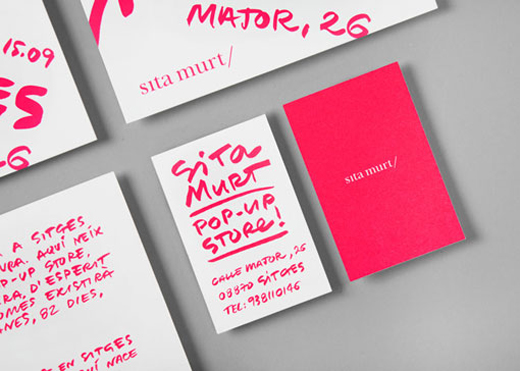

Sita Murt’s pop-up store with handwritten fluorescent pink typography might, honestly, be my favorite branding in a really long time. I tend to design with a clean, modern palette, that sometimes I forget how nice a loose, handwritten look can be. The neon color is a perfect punch.
via Design Work Life

Another vibrant color + amazing mark for Aava, from the branding agency, Bond.
via SeeSaw


I’m completely obsessed with this black and gold look for La Vittoria (a gala event to raise money for the Breast Cancer Foundation of Quebec). The use of typography in their menu BOOKS (woah!), the gorgeous photography, the aprons for the servers… not one thing was left untouched and unplanned.
via Design Work Life

